
Table of contents
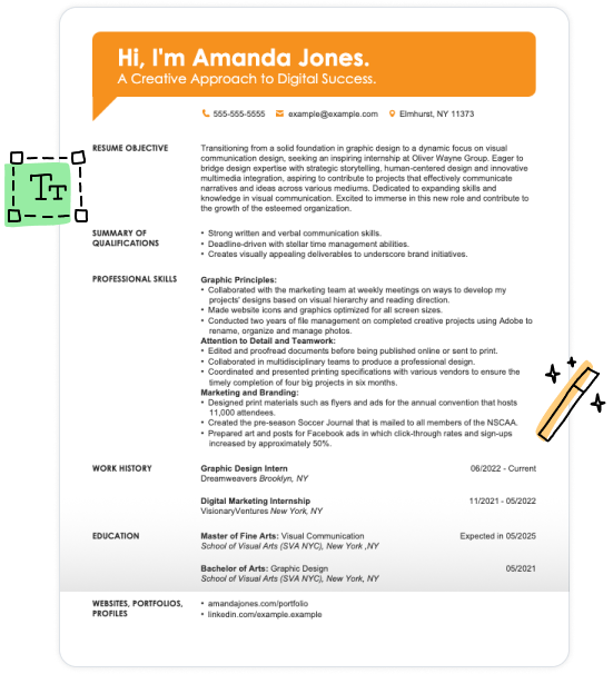
Your resume is your first chance to make a good impression, and your font choice is an important consideration to ensure employers see the potential in your resume.
Choosing the best font for a resume sets the tone and subconsciously demonstrates your professionalism. Plus, a strategic font choice will help your resume pass through ATS filters.
So, what’s the best font to use for a resume, and how do you sort through the options to find a font that’s right for you?
Our comprehensive guide will show you:
Ready to experiment with your resume’s style? With our AI Resume Builder, you can quickly and easily change your fonts around until you find one that suits you best. Plus, our resume builder offers unique, ready-made content, formatting help, and stylish templates to make your resume competitive in just minutes.
The 10 Best Resume Fonts for 2026
A resume font needs to strike all four categories: style, spacing, professionalism, and legibility.
Our top picks for the best fonts for a resume in 2026 excel in all of these areas, offering a diverse array of choices that cater to various tastes, from clean and traditional to bold and creative.
Font 1
Calibri
Calibri is a favorite in the corporate world, making it an excellent choice for resumes. Lucas de Groot designed this sans-serif font, which debuted in the 2007 Microsoft Office Suite.
Its rounded edges lend a touch of elegance, setting it apart from straightforward fonts like Helvetica and Arial. In the same year, Calibri replaced Times New Roman as Microsoft’s default font, marking its professional significance.
Choose Calibri for a reliable, business-standard font.
Font 2
Arial

Created in 1982 by Robin Nicholas and Patricia Saunders for Monotype, Arial is a digital homage to the renowned Helvetica.
This sans-serif font is celebrated for its clean geometry. It has become a staple for all sorts of professional documents, including resumes, and is now the default on Google Docs.
Choose Arial for a modern typeface with a width that helps the text stand out.
Font 3
Verdana
Another sans-serif typeface, Verdana was designed by Matthew Carter for Microsoft in 1996. The design is known for being clean and easy to read, even at a small size.
Originally designed for on-screen use, today Verdana is used in print and online in equal measure.
Choose Verdana for a professional yet unique touch, offering a style similar to Arial, with subtle changes.
Font 4
Garamond
As far as popular fonts go, Garamond is an old-timer. This serif typeface goes back to the 16th Century to the French engraver Claude Garamond.
One of the most important typefaces in history, Garamond is known for its refined design, including delicate serifs and timeless quality.
Choose Garamond for a classic and refined touch that is sure to stand out among other applicants.
Font 5
Georgia
Matthew Carter created Georgia in 1993 for Microsoft, making it one of the first typefaces specifically designed for on-screen use.
Made to be legible even at small sizes, Georgia’s strong serifs make for an elegant and versatile look that’s one of the best resume fonts for academic and professional settings.
Choose Georgia for a classic and refined touch that looks professional and stands out to employers.
Font 6
Roboto
Roboto is relatively new to the professional font scene. Created for Google in 2011 by Christian Robertson, this modernist typography was originally made for Android mobile devices but has since become popular in a huge range of print and digital media.
Choose Roboto for a minimalist design that invokes popular digital aesthetics, such as on iPhones and Facebook.
Font 7
Palatino Linotype
Originally designed for print media, Palatino Linotype was created by Hermann Zapf in 1948. Updated and expanded in 1993, this font is inspired by classic Roman typefaces.
This is one of the best professional resume fonts because its traditional serif typeface and symmetrical design are suitable for almost any job.
Choose Palatino Linotype to convey confidence and professionalism, reflecting its roots in traditional Roman typefaces.
Font 8
Trebuchet MS
Another Microsoft typeface—this one designed by Vincent Connare in 1996—Trebuchet MS offers a clean, modern design that’s slightly condensed in appearance.
Included in many versions of Microsoft Office, the font’s namesake is the trebuchet, a Medieval weapon used to launch large objects through the air.
Choose Trebuchet MS for a modern yet distinctive font that sets your resume apart from those using more common options like Arial.
Font 9
Bodoni MT
This classic serif typeface goes back to the Italian typographer Giambattista Bodoni, who created it to improve the quality of printing in Europe. Bodoni MT is one of several digital versions of this resume font, and it was released in 1999 with an update to the Windows operating system.
It’s popular with designers for the elegant look and contrast between thin and thick strokes.
Choose Bodoni MT for a blend of classic elegance and uniqueness, making your resume stand out.
Font 10
Tahoma
Among professional resume fonts, Tahoma stands out for its uniform stroke widths and simple letterforms. This font was also designed by Matthew Carter for Microsoft. Fun fact: the name “Tahoma” is the Native American word for “mountain,” chosen to represent the font’s strong appearance.
Choose Tahoma for its effective, straightforward design with uniform lines to add a bold touch to your resume.
Want to see how different fonts look on your resume? Our AI Resume Builder offers a variety of resume templates in different styles. You can easily customize your font choice to ensure that your resume features the best font for your professional brand.
What Is the Best Font Size for Your Resume?
Does font size matter? Why would an employer care as long as you have the right qualifications?
The answer is yes, font size does matter.
When you’re trying to showcase your resume skills and qualifications in just a few seconds, you should never let font size get in the way of legibility.
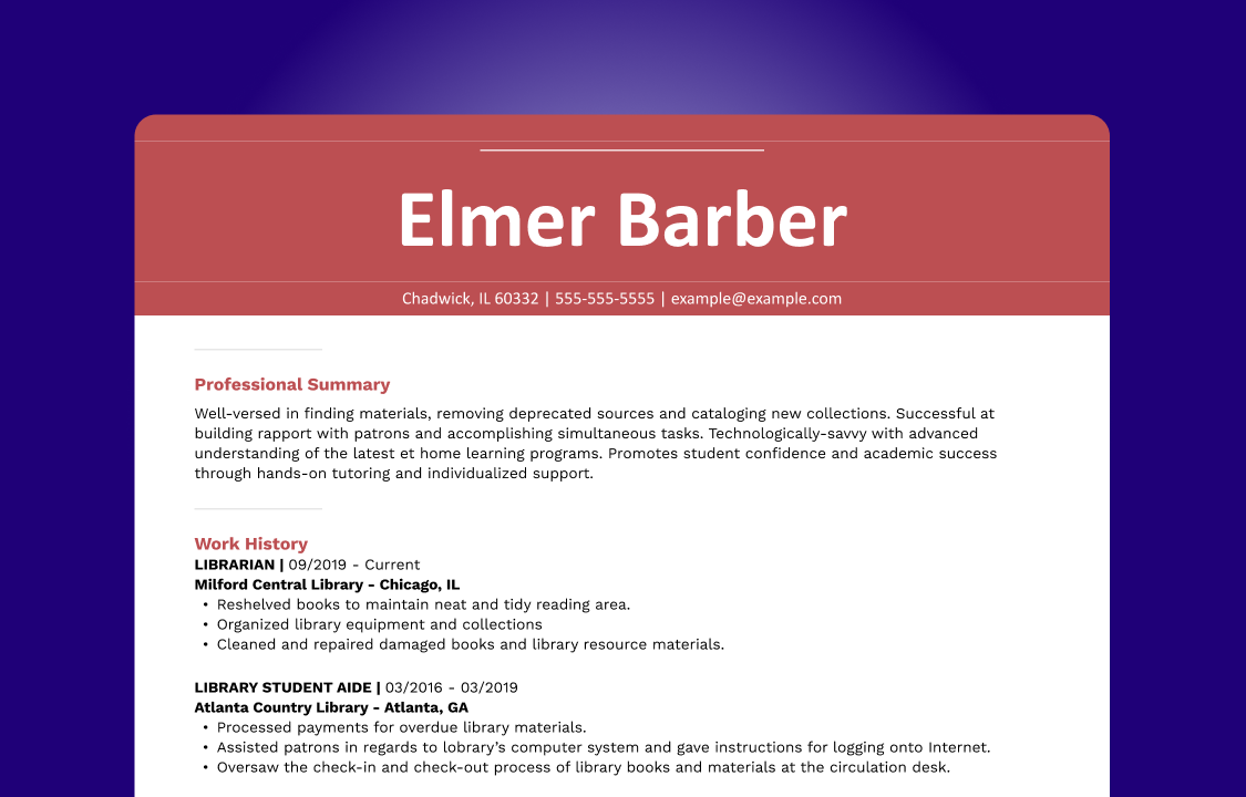
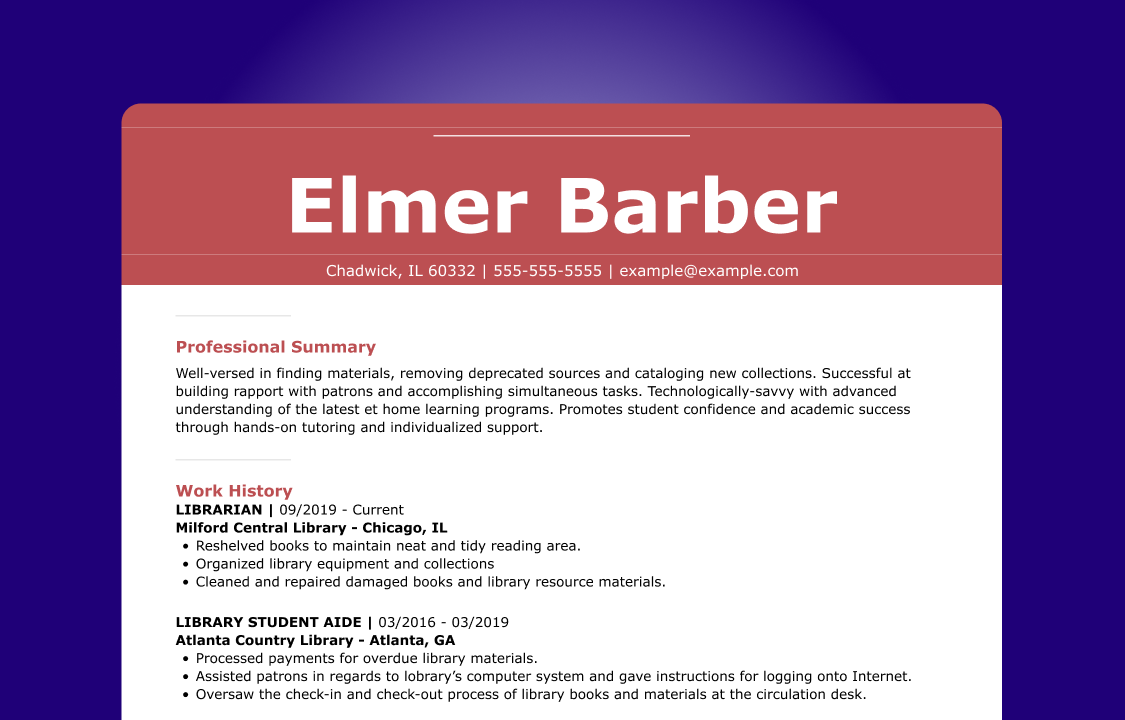
So, what’s the best font size for a resume? The rule of thumb is that the font size should be between 10 to 12 pts. for the main content. You may be able to go one point larger for a particularly small font or one point smaller for a wide, tall font.
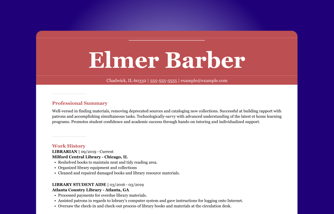
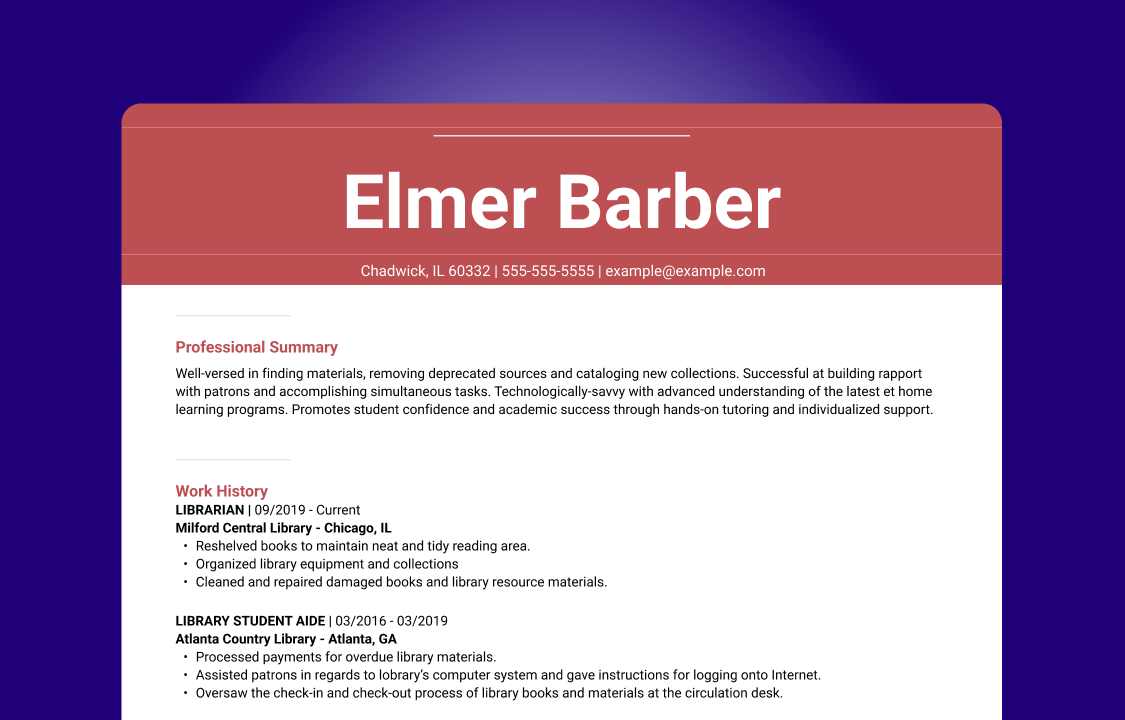
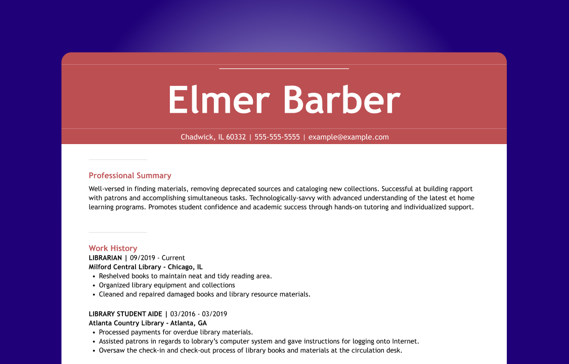
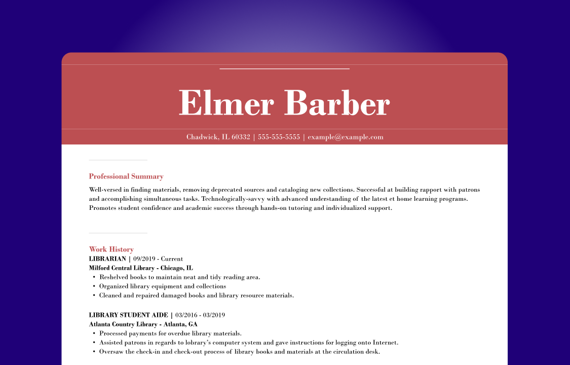
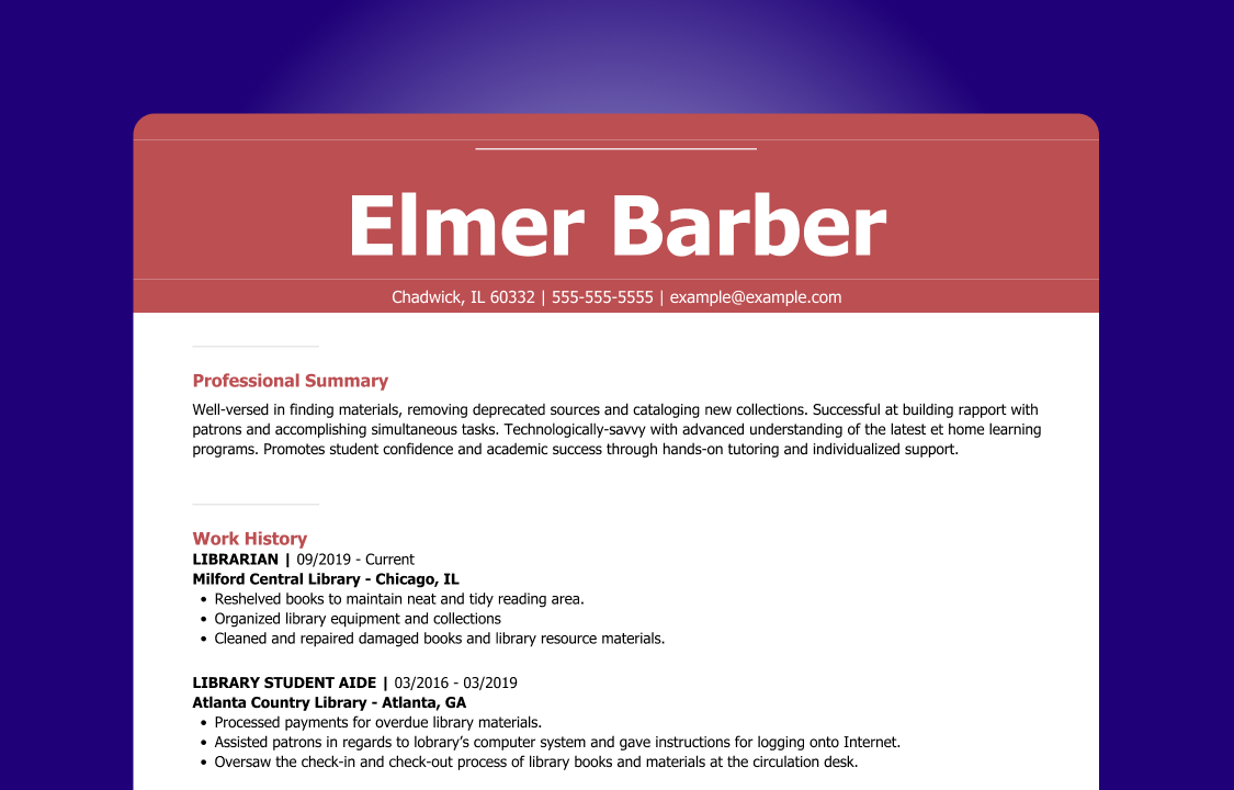
Let’s see how different font sizes impact the look of a resume. We’ll compare resumes with fonts that are too large, too small, and just the right size:
Even though a difference of a few font point sizes seems like a minor detail, you can see for yourself how much font size can impact legibility.
While your body paragraphs should be a single consistent font, for the sake of organization, the main header and section headers should be larger. Here are the best font sizes for resume section headers:
- Section headers should be between 14 to 16 pts.
- Resume header (your name) should be between 28 to 35 pts.
Now that you know how to use the correct resume font size, let’s go over some key tips.
How to Format Your Resume Font
Picking the best resume font and sizing it correctly is just one consideration to keep in mind as you ensure that your resume is properly formatted. Let’s take a look at common debates about resume fonts.
Font color
There are two main rules for choosing a resume font color:
- Black is always highly recommended. Employers will never complain when you use black font. It’s the go-to color for millions of job seekers.
- Be careful with non-black fonts. If you want to use something other than black, make sure it is easy to read and consistently applied. For example, a dark turquoise might work, but baby blue would not. The latter is too light and hard to read. Also, if you make one header a dark turquoise blue, then all headers should be turquoise. Consistent formatting makes your resume look professional.
Interested in experimenting with color on your resume? You may want to try a creative resume template that uses colorful and playful design elements to convey personality while maintaining a professional style.

Font styling
There’s more to font styling than your choice of font, but what style choices are a good fit for your resume? Here are the common styling choices and how they contribute to a resume’s clarity:
- Italics are useful for calling out different types of information. For example, in a work history section, you should put the dates in italics to set them apart from the job title and company name.
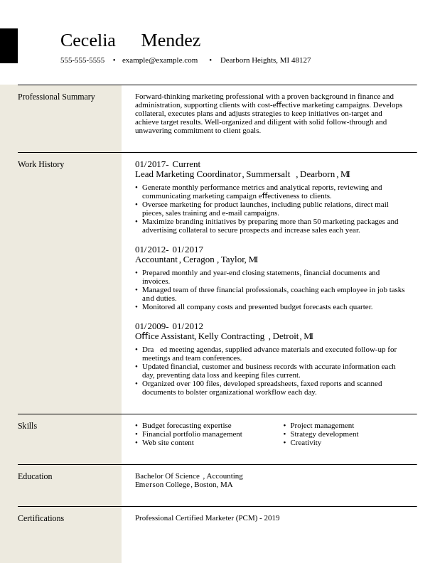
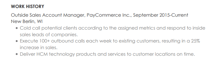
- Bold is often used in section headers or to highlight important information. For example, many simple resume templates put job titles in bold. This makes it easier for readers to see your career progression.
- Underlining should be used sparingly, if at all. Underlined text is hard to read, can get confused for hyperlinks, and makes the page feel cluttered.
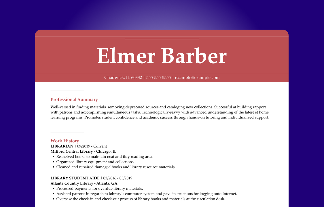
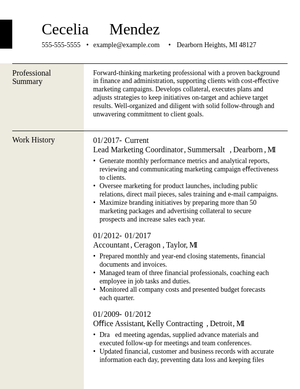
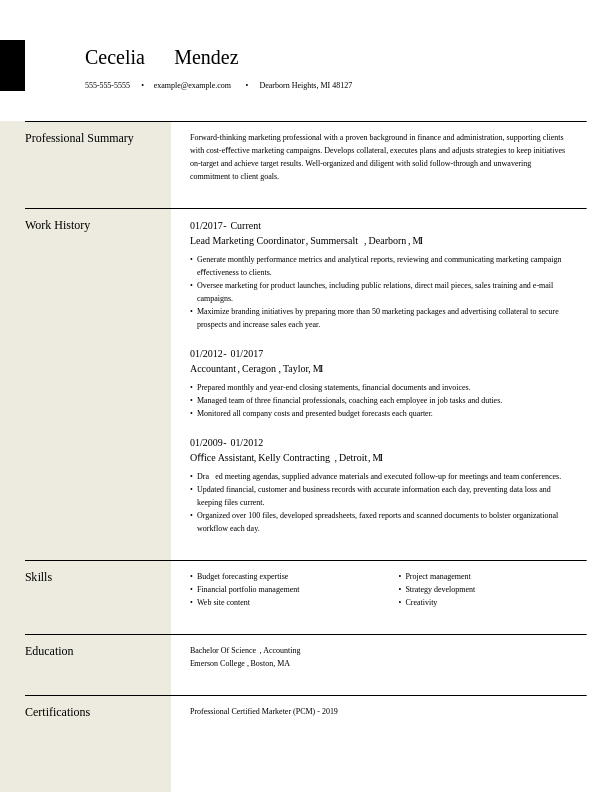
Now, see how this example uses a bold font to differentiate between information:
Mixing fonts
Generally speaking, mixing fonts isn’t a good idea. It can make your resume look cluttered and inconsistent.
Even if you limit the different font choices to the section headers, different fonts introduce opportunities for recruiters and ATS scans to be confused by your resume’s style. That’s why an ATS-friendly resume template will always use one font throughout the document.
However, if you’re a designer with an in-depth knowledge of typefaces, go for it. You’ll have the background to make judgment calls that are less likely to backfire.
Serif vs. Sans Serif: Understanding the Difference
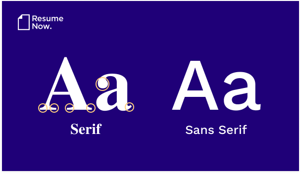
- Serif fonts: These fonts have small decorative strokes (serifs) jutting out of each letter in the alphabet. Many older, classic fonts like Garamond and Times New Roman are serif fonts.
- Sans-serif fonts: These fonts don’t have these decorative elements. Instead, the letters are made up of clean, straight lines without (“sans”) flourishes. Designers see these fonts as modern and cool.
Either one of these styles can look great on a resume. It’s up to you to decide which you prefer. Just make sure to double-check that the serif font you choose is readable by ATS. The most common and professional serif fonts are, but less common serif fonts may be illegible to ATS.
Matching Fonts to Your Cover Letter
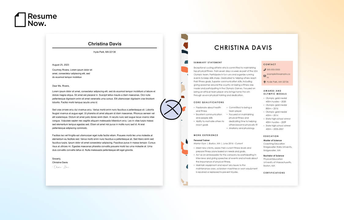
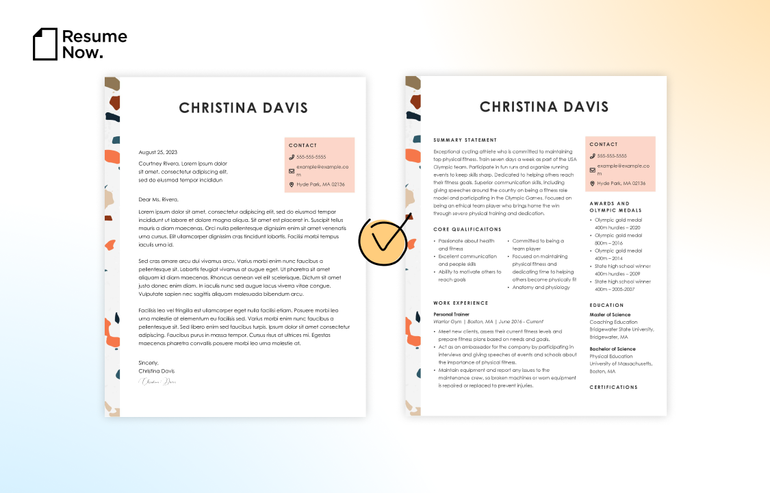
See the difference? When you pick the best font for a resume, you’re also picking a font for your cover letter. It’s crucial that you pick a font that you like for both documents. Check out our library of cover letter examples to get a reference for what a stylish cover letter looks like as you style your own.
Speaking of making sure your resume and cover letter match, you should also choose a cover letter template that complements your resume. Try our AI Cover Letter Generator to get it done even faster.
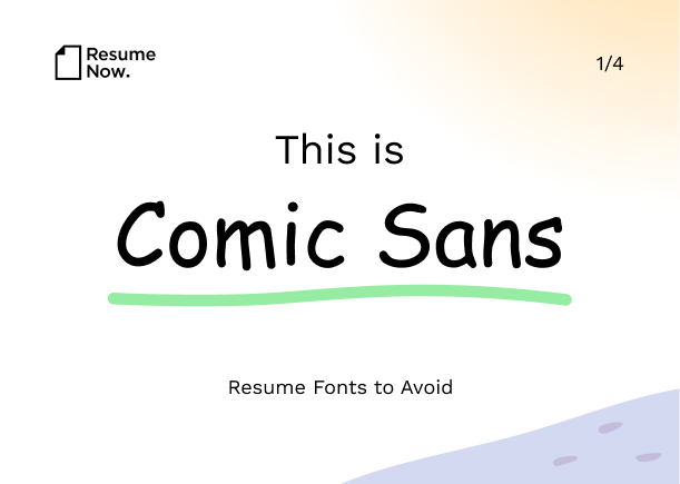
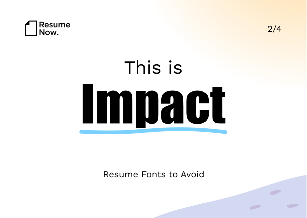
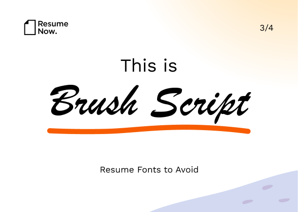
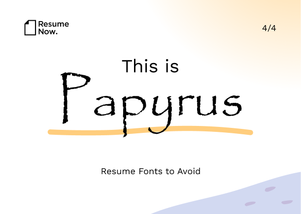
Resume Fonts to Avoid
You know the best resume font to use this year, but what about the worst? Here are four resume fonts you shouldn’t use under any circumstances.
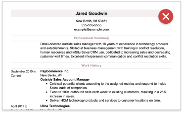
A classic no-no. Microsoft released this typeface in 1994 to mimic a style found in comic book speech bubbles. Today, it comes off as silly and unprofessional.
The look of this font is very thick and compact, making it difficult to differentiate between letters. Recruiters will toss a resume they can’t read, so it's best to avoid this font.
Although this font attempts to be fancy, in practice, when you put the strokes together, it’s too splotchy and cramped. It strains the eyes and can get your resume instantly rejected.
This hand-drawn typeface is meant to look like it’s written on parchment. Hard to read, but the playful, hand-drawn appearance can also look tacky and cheap in a professional setting.
What Fonts Work Best for an Applicant Tracking System (ATS)?
Over 95% of Fortune 500 companies use an ATS to screen job applicants for the skills and qualifications demanded by the role. There’s a good chance every job seeker has had their resume run through one of these systems at least once in their career.
Many tracking systems also have trouble processing resumes with certain design elements, like special fonts and background graphics. Anything unusual could trip up the system.
What’s the best way to make sure your resume is readable? Use an HR-approved resume template. There are modern designs and professional styles to choose from, as well as eye-catching creative templates for innovative tastes.
Resume Fonts FAQ
Last Updated: January 09, 2026
- Trebuchet MS
- Arial
- Calibri
- Book Antiqua
- Georgia
- Cambria
- Comic Sans
- Papyrus
- Brush Script
- Mistral
- Impact
- Lucina Console
Don is a Certified Professional Resume Writer (CPRW) with more than 10 years’ experience creating digital content, including four years helping job seekers develop their careers. He holds an M.S. in Journalism from Northwestern University.
More resources

8 Leadership Courses That Boost Salaries & Build People Management Skills
Resume Now s new report spotlights leadership certifications...

Transferable Skills: Examples & How to List Them on Your Resume
Write a resume that stands out by making the most of your tran...

How to Use Resume Now’s AI Resume Builder for Free
Try Resume Now s AI-powered Resume Builder for free to access ...

General Laborer Cover Letter: Examples & Templates
As a general laborer you need to present your skills effectiv...

Contractor Cover Letter: Examples & Templates
As a contractor you need a cover letter that highlights your ...

Construction Estimator Cover Letter: Examples & Templates
As a construction estimator you need to present your ability ...