


Table of contents
Employers receive dozens, sometimes hundreds, of resumes for each role. They use applicant tracking systems (ATS) to screen their content and may only spend seconds looking at resumes themselves before selecting candidates to interview.
This means that you need to know how to format a resume that communicates efficiently and stands out from the competition. Our guide can help you do it.
In this guide, you’ll get:

Tired of losing your formatting every time you tweak your resume? The best way to keep your formatting picture perfect is to use our AI Resume Builder. You can add and delete content or change the design while the formatting stays immaculate.
How to Format a Resume Step by Step
1. Choose a template
2. Adjust margins
Resume margins should always be set at 1 inch on all four sides for maximum readability. It’s acceptable to reduce your margins to half an inch on all sides if you need extra room for your content, as long as it doesn’t make your information messy and challenging to read.
Margins larger than 1 inch tend to make your text look like it’s floating and give the impression that you don’t have much information to include.
3. Pick a font type and size
Font type
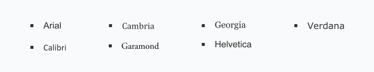
Pro tip: Don’t mix and match fonts on a resume. Choose one and stick with it!
Font size
4. Add section headings
- Awards and honors
- Training
- Certifications and licenses
- Volunteer work
- Special projects
- Languages
Pro tip: Keep font size uniform throughout your resume except for the headers, which can be one or two point sizes larger than the rest of your text.
5. Align your text
6. Check for appropriate spacing
7. Add bullets where appropriate
Pro tip:
Format your resume for applicant tracking systems (ATS)
ATS are programmed to scan resumes and cover letters for relevance based on keywords that match the job, and they can be fussy about formatting. Avoid unusual layouts and fonts that could get blocked by this screening software.
Here’s What People Are Saying About Us
Correctly Formatted Resume Examples


Resume Formatting Template
Email address: example@example.com | Phone: 555-555-5555 | Link to LinkedIn profile or personal website
Detail-oriented [job title] with over [no. of years] of experience, able to maintain a high standard of [relevant skill] and [relevant skill]. Expertise in [list of relevant skills]. Knowledgeable in [relevant hard skills, like software programs]. Tactical team player interested in leveraging proficiency in [more skills found in job listing] to support the mission of [company’s name] as a [position name].
Most Recent Job Title | Start Date – End Date (or Current)
Employer Name | Location
- Start with your current or most recent job title.
- Add a few accomplishments for each job in bullet points.
- Concentrate on including significant work responsibilities and achievements, not daily duties/tasks.
Previous Job Title | Start Date – End Date
Employer Name | Location
- Focus on the duties and qualifications that are needed to perform the desired job.
- Write short sentences in the active voice that show your accomplishments (e.g., “Managed a team of eight graphic designers”).
- Quantifiable metrics, like “maintained 99% retention rate,” will give your accomplishments more power.
Degree Name | Field of Study
University, Location | Date of Completion
- List your skills that most closely match the skills in the job listing.
- Include a variety of hard skills and soft skills for a total of six to 10 skills.
- Cite the names of specific software programs and tools you use.
- Optional sections offer an opportunity to share other relevant information.
- Possible additions include publications, languages, volunteer activities, and professional memberships.
More Resume Formatting Advice
Only include relevant information
Never use first-person pronouns
“Demonstrated success in special projects, schedule coordination, and business operations.”
“I contributed to special projects, schedule coordination, and business operations.”
Formatting consistency is critical
How a Resume Builder Makes Formatting Simple
Want to get the stress of formatting your resume off your hands? Resume Now’s Resume Builder provides the built-in tools you need to build your resume quickly and effortlessly.
Our builder ensures you use the correct fonts, margins, and spacing, and that your resume’s sections are in the appropriate order so that your qualifications shine with the professional polish employers want.
Resume Formatting Do’s and Don’ts
Do
- Format your resume to fit on one or two pages maximum.
- Be consistent throughout your resume.
- Use only standard circular bullet points.
- Use short sentences and bullet points to emphasize your strengths.
- Organize your content under appropriate headers.
- Match your resume’s style to your industry.
- Proofread your resume to make sure it’s perfect.
Don’t
- Use gimmicky or colorful fonts.
- Insert tables or graphs.
- Add graphics.
- Select a resume template or format that’s inappropriate for your goals and background.
- Try to cram more information than necessary in your resume sections.
- Justify your bullets. They should be left-aligned, so they are easy to skim.
- Use all caps unless it’s an acronym or the name of something is written that way.
How to Format a Resume FAQ
Several fonts work well for resumes, including: 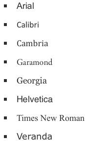
Never use a font size smaller than 10 points if you want hiring managers to read your resume, and don’t go above 12 points for any text except section headings. It’s acceptable to make your section headings one or two points larger than the rest of your text.
Proper margins for a resume are 1 inch all around. A half inch is acceptable if you need extra space, but any smaller and your text won’t be legible. Margins bigger than 1 inch on all sides look unprofessional and take up valuable space you could otherwise use for content.
A proper resume layout follows either a chronological, functional, or combination format. Choosing from these resume formats will guide you in organizing your job titles, work experience, and skills.
Always write dates with just the month and the year. You can either:
- Write them out in full, like January 2021.
- Abbreviate them, like Jan. 2021.
- Use numbers, like 01/21.
All three are acceptable. Use whichever format looks best in the template. Most importantly, once you pick a style, stick with it.
Employers look for keywords that match the job description and words that emphasize the applicants’ strengths. Hiring managers notice power words that denote action, such as “supervised,” “planned,” “designed,” and “produced,” along with section headings and highlights that contain the words “awards,” “achievements,” and “accomplishments.” And don’t forget to add numbers when you can—they make accomplishments pop!
While the text within each resume section should be left-aligned, headers are different. A header can be center-aligned or left-aligned, depending on the resume template. Both are acceptable. What’s important is, whichever alignment you choose, make sure you stay consistent. If you center-align one header, then all of them should be center-aligned.
If you’re wondering how far back a resume should go, the general rule of thumb is no more than 10 or 15 years. This means that every time you update your resume, you should look for opportunities to shorten each section by cutting older, irrelevant jobs or out-of-date skills.
For resume length, you should keep your resume down to one or two pages. While playing around with the formatting can shorten your resume, be careful. Font size can range from 10-12 pts., while margins should be around 1 inch on all sides.
The best way to format a resume in 2025 is to use a resume maker. Formatting everything yourself from scratch is difficult. Making your resume in Word can lead to formatting frustrations, whether trying to keep your bullet points aligned or adding a new section. Resume builders automate the process from beginning to end, so no matter what changes you make to the resume, your formatting stays perfect.
Employers mostly prefer the reverse-chronological resume. This format puts experience at the forefront. Hiring managers like how easy it is to see a candidate’s work history summarized in bullet points. Chronological resumes have been used for decades and will likely remain popular for years to come.
1. Use white space thoughtfully: A healthy amount of white space is good for helping the eye move around the page. A great resume will have a harmonious balance between text and white space.
2. Don’t go wild with your font choice: Professional resume writers pick their font types from a select pool of options and make them big enough to be legible but small enough not to overwhelm the page.
3. Use bullet points to make your resume more readable: Well-formatted resumes often use bullet points to make some information, such as measurable achievements, stand out.
4. Be consistent with the margins: Resumes that are formatted correctly arrange their text around perfectly set margins, which help employers find what they’re looking for, fast.
5. Be consistent with alignment: Text should be aligned the same (left, right, or center justified) from line to line in every section, though the header might be different, depending on the template design.
Don is a Certified Professional Resume Writer (CPRW) with more than 10 years’ experience creating digital content, including four years helping job seekers develop their careers. He holds an M.S. in Journalism from Northwestern University.
More resources
")
How to Write a Resume With ChatGPT (Step by Step Guide & Prompts)
Learn how to write a resume with ChatGPT using targeted prompt...

Transferable Skills: Examples & How to List Them on Your Resume
Write a resume that stands out by making the most of your tran...

How to Use Resume Now’s AI Resume Builder for Free
Try Resume Now s AI-powered Resume Builder for free to access ...

How to Write a Resume: Guide & Examples for 2026
If you re wondering how to write a resume that grabs attenti...

References Available Upon Request on Your Resume: Is It Necessary?
References available upon request is a phrase added to the bot...
")
Customer Service Skills to List on a Resume (30 Examples)
Looking to highlight soft and hard skills on your customer ser...