

Want to improve your chances of landing a job? Let’s make sure your resume makes the best possible impression on potential employers. The content of your resume is important, but any recruiter will tell you that first impressions are everything. Even the best-written resume won’t make a strong impact unless you use the best resume layout for your needs.
Resume layouts help you structure your resume for maximum impact. If you put every section in the right place, recruiters can scan your resume quickly and understand what you bring to the table with just a glance. A great resume layout makes your resume easy to read and draws focus to your strengths as a candidate.
Job seekers who master the art of the resume layout achieve more success in their job search. But how do you use resume layouts to your advantage? Don’t worry! Our guide will walk you through the ins and outs of layouts.
The best resume layout for most candidates
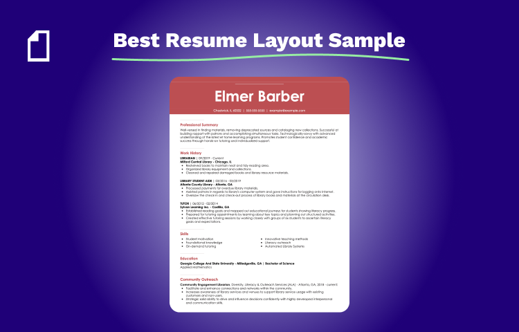
Before we get into the complete list of layout options, we want to show you a resume layout that works perfectly for most job seekers, regardless of their career field or experience level.
The layout below is a chronological resume, which puts work experience at the forefront. The way it’s organized makes it very clean and easy to read, which is essential when recruiters only spend about seven seconds looking at a resume.
Organizing your work experience in reverse-chronological order is a fantastic way to guide the reader through the story of your career, no matter your industry or goals. Plus, you get to showcase your professional skills, whether they’re hard technical skills or more subtle interpersonal skills. Showing how you’ve put your hard and soft skills to work in real world scenarios will help you stand out as a capable and experienced candidate.
If you are gearing up to apply for a job and need a resume quickly, this layout would be an excellent selection because it plays to most candidate’s strengths and because it is the most common and expected resume layout, so recruiters will be very familiar with it.
Now that you’ve seen the perfect layout, let’s dive into why this resume layout example works so well, particularly the choices in margins, font size and other formatting options.
Resume layout guide: margins, font size, line spacing and style
A great resume layout is clean, well-organized and easy to read. Organizing your resume effectively is one of the most important ways of impressing an employer and getting your document through those pesky applicant tracking systems (ATS).
All you need to do is follow a few basic formatting rules to create a professional layout. Once you’re done reviewing the tips here, you can find even more in our resume formatting guide.
Set your margins and spacing
Resume margins should always be about 1 inch on all sides. Going above or below 1 inch will quickly make a resume look too cramped or too padded. Using 1-inch margins strikes the right balance.
However, in the event that you’re trying to get your resume length down to one or two pages, feel free to adjust the margins on the sides to about .6 inches. Never make them smaller than that, and only do so cautiously. If you aren’t confident in your formatting abilities, we recommend sticking to the basic 1-inch margins for the sake of simplicity.
Another vital consideration is line space. Line spacing should be set between single space and 1.5 spacing. The important thing to remember here is consistency. Your line spacing should be the same throughout your document. Finally, every section must have a line break after the section header.
Choose a professional font
No matter how well you lay out your resume, a poor choice of font can make you look unprofessional. Limit yourself to safe, reliable font types.
Any of these fonts would be appropriate on a resume:
- Arial
- Calibri
- Cambria
- Garamond
- Georgia
- Helvetica
- Times New Roman
- Veranda
On that note, be careful about font size. Your font should be no smaller than 10 points and no larger than 12 points.
Keep the design simple
While it may be tempting to try to stand out with a complicated design, you’re much better off sticking with one of our simple resume layouts. Unless you are applying for a graphic design role, employers will mainly consider whether your resume is easy to read. They won’t care as much about your use of color or impressive design tricks.
We offer templates in a variety of styles, all of which are compatible with Google Docs and Microsoft Word. Browse our library of resume templates to find the perfect resume for you!
Make an eye-catching header
Contact info is one of the most essential parts of your resume, so you’ll want to make it easy to spot. The last thing you want is for recruiters to have a hard time contacting you because of a wonky header.
Prioritize having a prominent header with clear and accurate contact information at the top of your document. As long as you don’t overdo it, a simple pop of color can help your header stand out on the page.
There’s no need to go overboard — we still advocate for a simple design — but you do want to be noticed. Here’s an example of a fittingly attention-grabbing header:

Organize content into easy-to-scan sections
A well-organized layout will draw the eye from section to section using clearly defined headers, all using the same line spacing and font size and type.
As for which sections to include, every resume should have:
- Contact info.
- Professional summary or resume objective.
- Work experience.
- Skills, featuring hard/technical skills and soft skills.
- Education credentials.
Depending on what you have to offer, you may want to consider including additional sections like certifications, volunteering, languages, awards and professional associations.
Use bullet points effectively
Bullet points are a great way to make your document easily scannable. You can use them in the following areas:
- Four to six bullet points for each job in your work experience section.
- Listing your skills in your skills section.
Ultimately, use bullet points whenever you need to break up the text to highlight key points. Just be mindful of the length of your bullet points. If your resume layout uses columns, longer bullet points can take up a lot of lines.
Be mindful of length (no more than two pages)
Unlike CVs, which list your entire professional history, resumes don’t need to be exhaustive. Instead, they should focus on your most recent (and relevant) history.
If you have fewer than five years of experience, your resume should be no longer than one page. After that, you can consider adding a second page if you need more space for your accomplishments.
In the end, never go longer than two pages. Eliminate more distant work experience or shorten your skills section — whatever you need to do (within reason) to get your resume to the appropriate length.
It can be tempting to throw in any detail that you think might help your job search, but your resume isn’t intended to tell your entire professional story. It’s meant to be a concise overview to give potential employers an idea of how well you match their needs.
Resume layout examples in every style
Resume layouts come in many different flavors. From clean and crisp to colorful and creative, there’s a layout style perfect for anyone.
Each layout serves a different type of job seeker. For example, if you work at an investment bank or a law firm, you should pick a professional resume layout that is neat and understated. On the other hand, if you’re an on-set photographer in the film industry or a wedding DJ, the best resume layout for you might use a more colorful style that communicates more of your unique personality.
Here are four of the most popular resume layout examples to choose from.
1. Modern resume layout example

With an eye-catching blue header and plain white background, this modern resume layout is sleek and easy to follow.
Modern resume layouts offer a strong balance between simplicity and personality. In this case, a bold heading with a colorful header bar and eye-catching white text draws the eye into a resume whose content is arranged neatly and intuitively.
This layout is an excellent choice for job seekers who want polished but unique resumes.
See more modern resume layouts.
2. Creative resume layout example

With creative layouts, you get to have a little more fun. The layout above creates a balance between light and dark, with a geometric pattern in the background that the employer is unlikely to find in other candidate resumes.
This layout is great for anyone in a creative field who wants to stand out from the competition.
See more creative resume layouts.
3. Simple resume layout example

Choosing a simple resume layout helps bring attention to your core skills and accomplishments. This layout in particular leaves plenty of white space between the resume sections, making for an uncluttered design.
Simple layouts are perfect for anyone who wants a no-frills resume design.
See more simple resume layouts.
4. Minimalist resume layout example

This minimalist resume style is sleek and neat with a basic vertical organization that lays out the candidate’s qualifications, skills and work history from top to bottom. Its unique typeface adds a touch of character without compromising on the simplicity of its style.
Minimalist templates are a great choice for candidate’s who want to keep their resume focused on the important stuff.
See more minimalist resume layouts.
Now that we’ve shown you how the style can vary dramatically from resume to resume, let’s see the three ways you can structure its layout. Knowing where to place each resume section is a significant part of creating a winning resume.
How to choose the best resume layout for you
There are three primary resume formats based on section structure. Each differs slightly in its purpose:
- Chronological
- Functional
- Combination
You need to understand the nuanced differences between these layouts to choose one that is appropriate for you and the role you seek. Now, let’s see the three options for formatting your resume and how they differ:
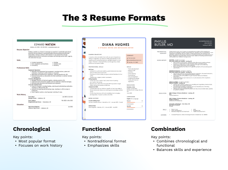
As the image illustrates, chronological resumes focus on work experience. This format is by far the most widely used in the job market, so recruiters and employers have come to expect it.
The functional resume layout places an emphasis on skills, downplaying a candidate’s work history. In some cases, this style will include a second or even third skills section. Combination resumes do precisely what the name suggests — combine the qualities of the chronological and functional by giving equal weight to experience and skills.
Now, who should use each of these formats? That depends on where you are in your career.
Let’s run down which job seekers are suited for each format.
Use a chronological resume layout if:
- You can showcase a clear career trajectory.
- You’ve held more than one or two jobs.
- You’ve been employed for at least one year.
Use a functional resume layout if:
- You recently graduated high school or college.
- You have no work history.
- You’ve held a series of short-term positions.
Use a combination resume layout if:
- You are returning to the workforce after a break.
- You are in the middle of your career and want to highlight your experience as well as skills.
- You have a solid work history but want to showcase specific skills.
Once you decide which one of these core layouts best serves your career, you can finalize the look, feel and structure of your resume.
Browse our layout library to find a look that works for you.
Hailey is a career advice writer dedicated to helping job seekers excel in their careers.
More resources

8 Leadership Courses That Boost Salaries & Build People Management Skills
Resume Now s new report spotlights leadership certifications...

Transferable Skills: Examples & How to List Them on Your Resume
Write a resume that stands out by making the most of your tran...

How to Use Resume Now’s AI Resume Builder for Free
Try Resume Now s AI-powered Resume Builder for free to access ...

CEO Cover Letter: Examples & Templates
As a CEO you must convey your leadership vision and strategic...

Buyer Cover Letter: Examples & Templates
As a buyer you need a cover letter that highlights your negot...

Business Manager Cover Letter: Examples & Templates
As a business manager you need a cover letter that highlights...